La Loteria
Package Design
Package Design
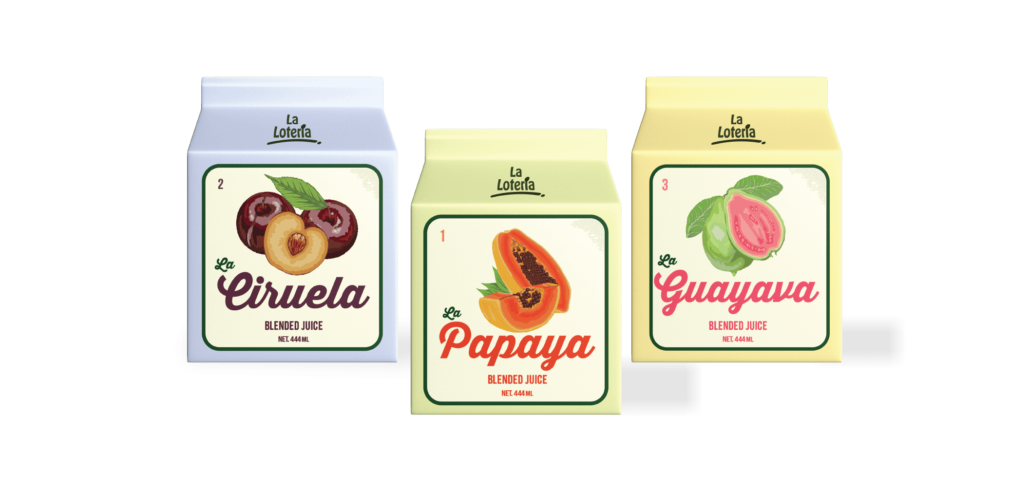
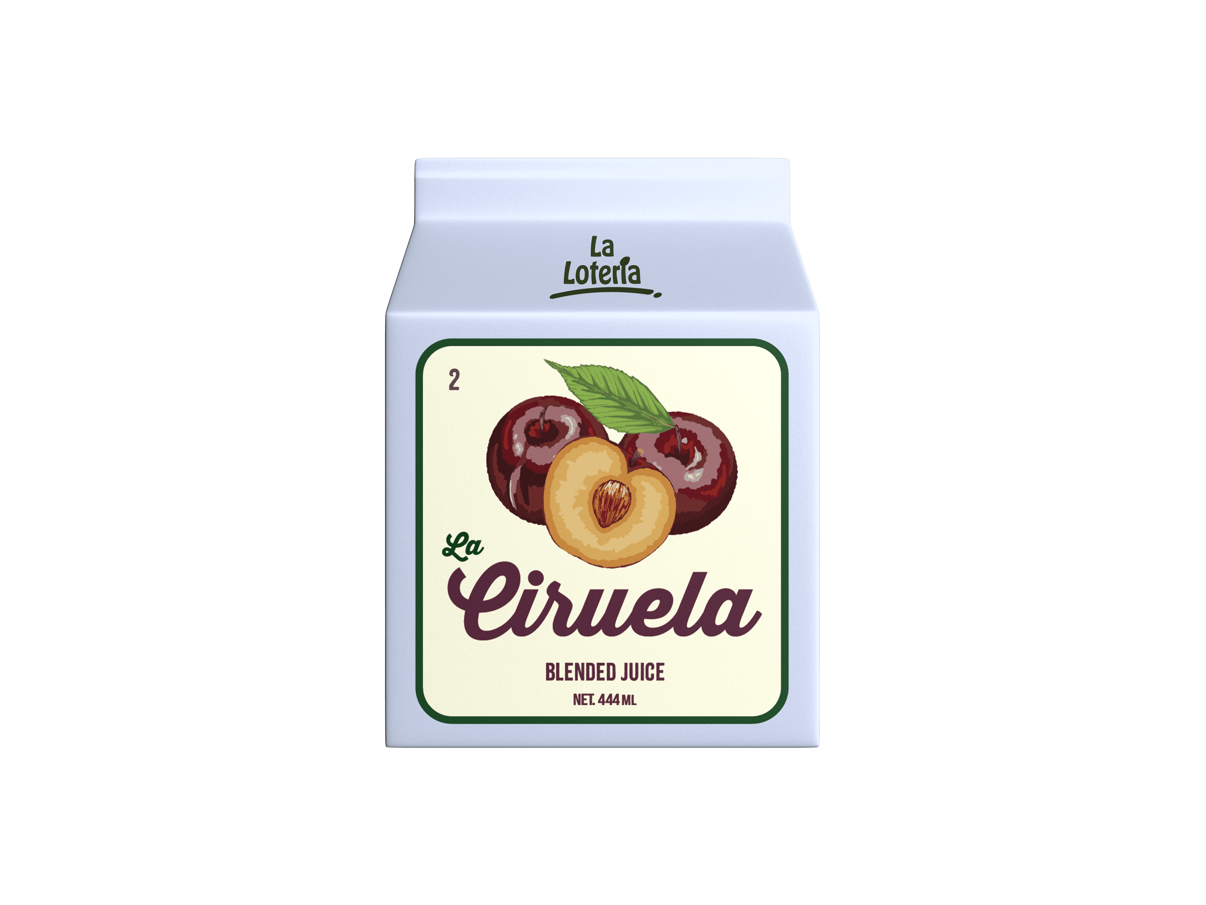
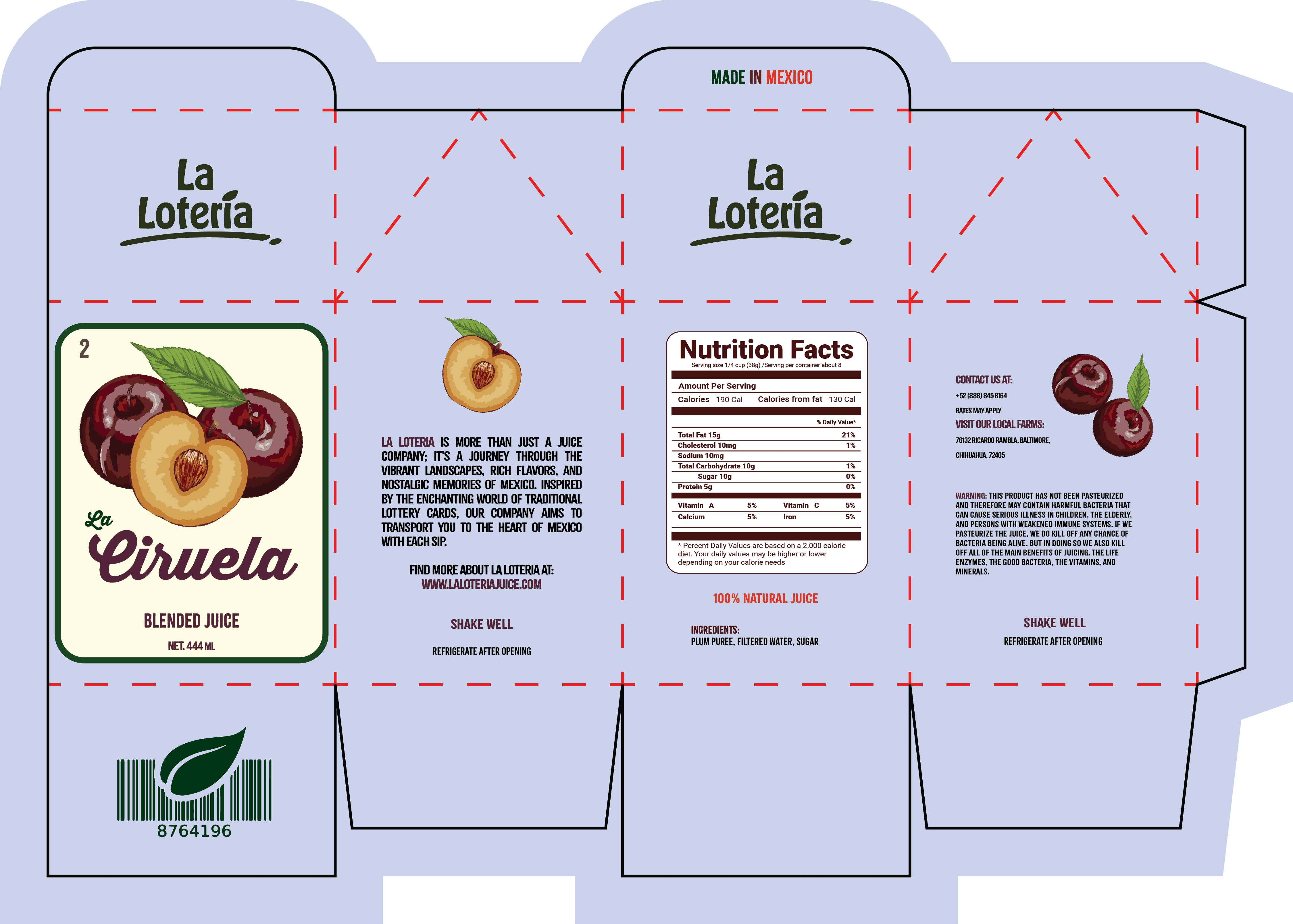
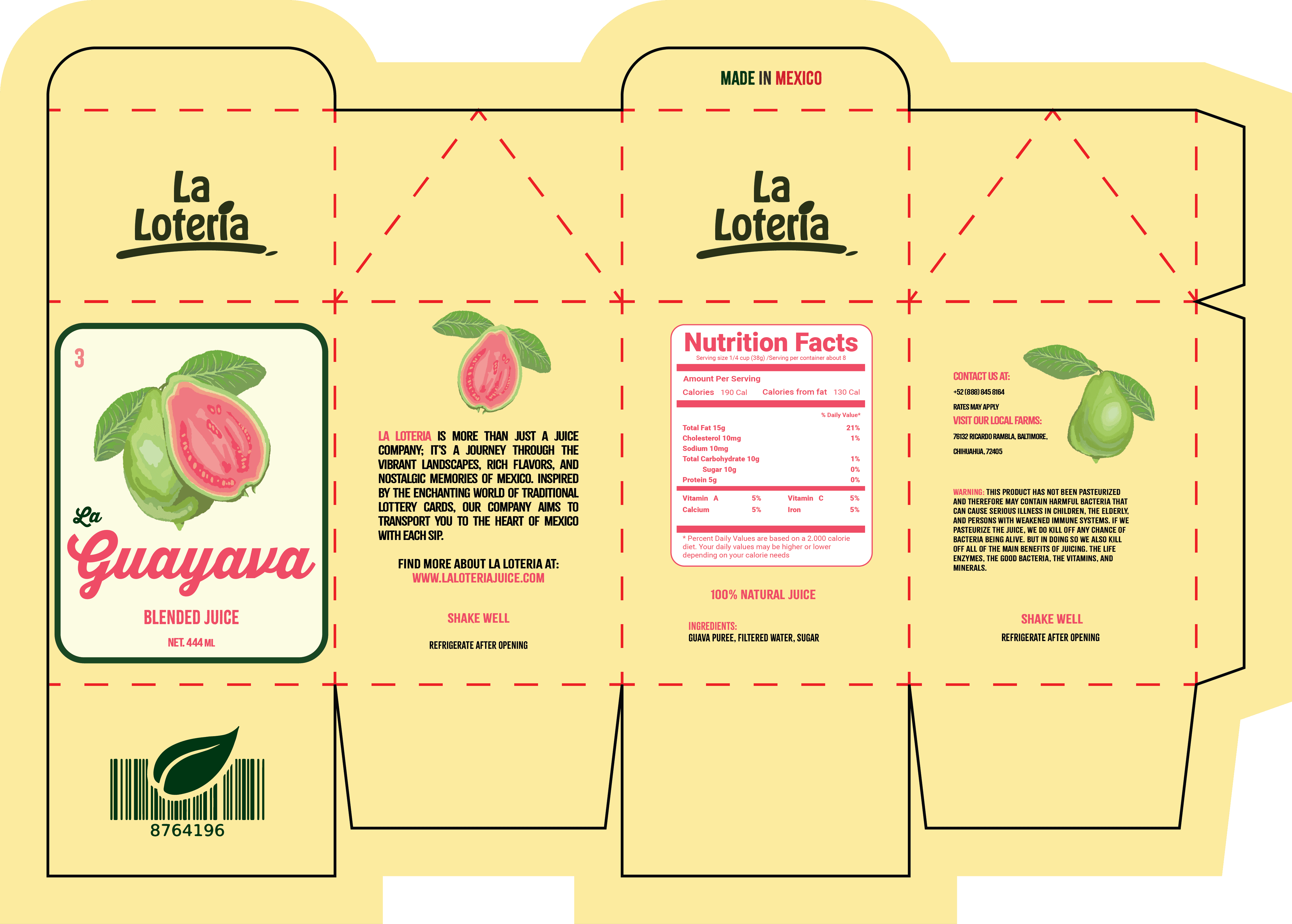
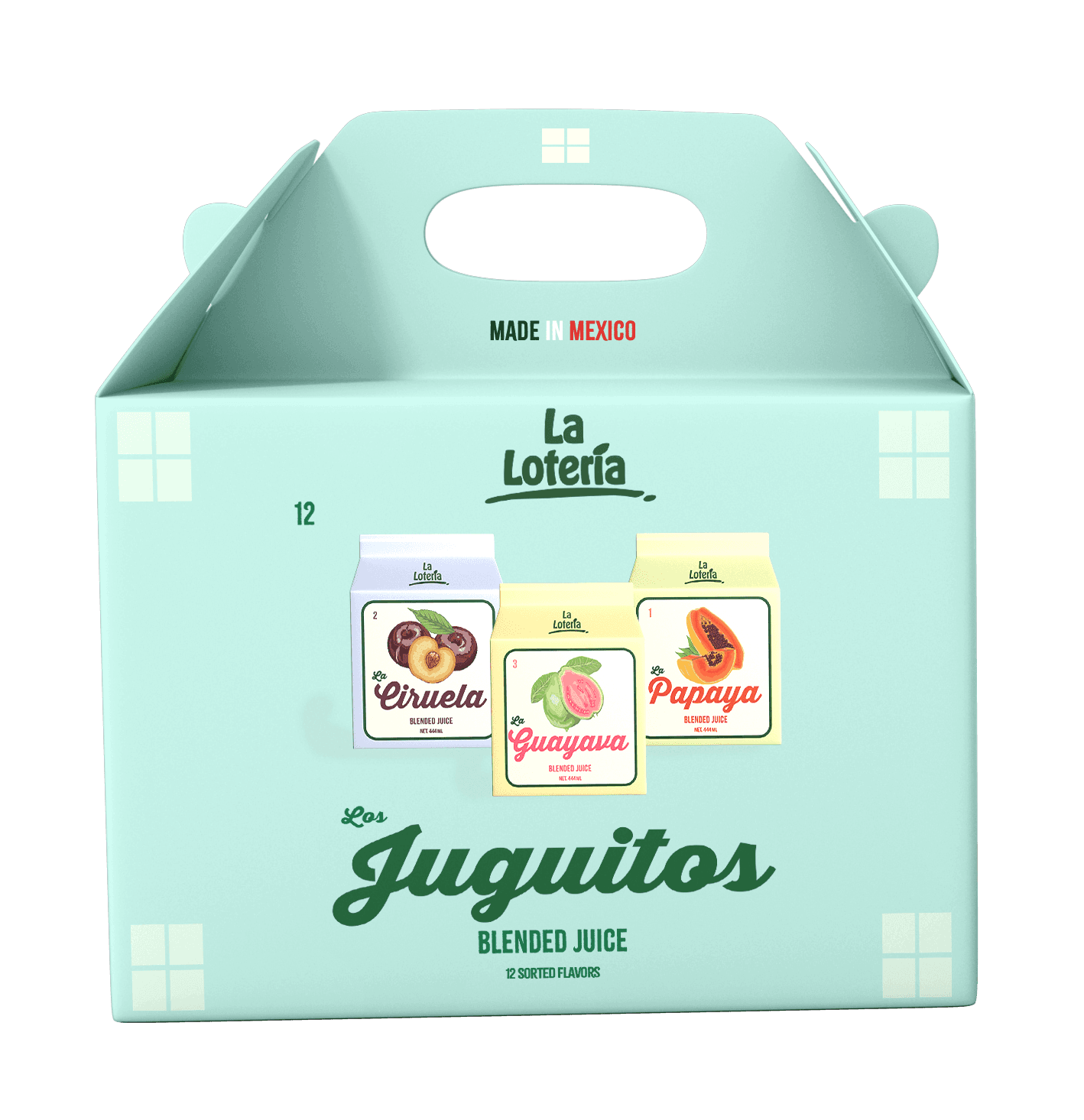
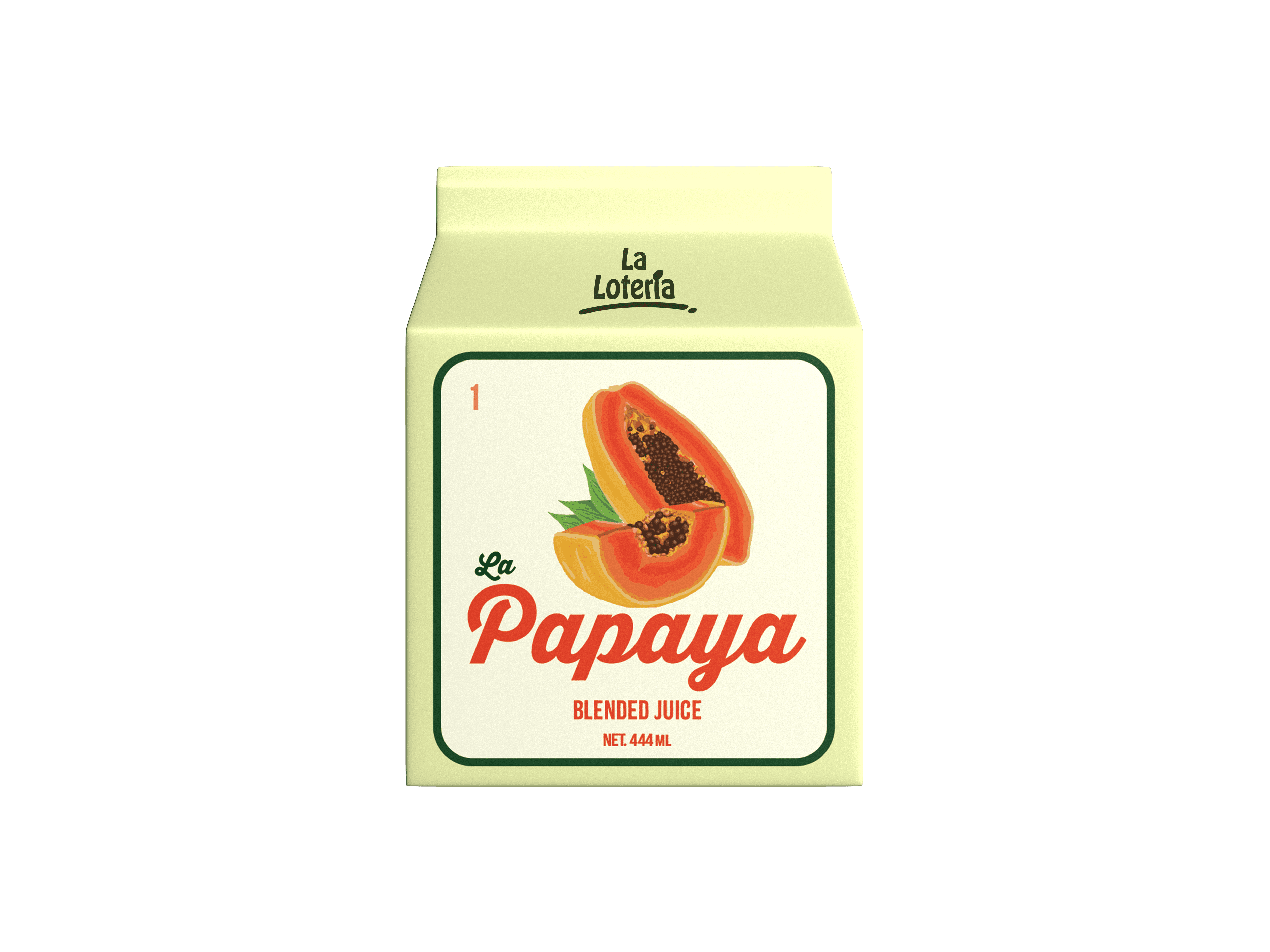
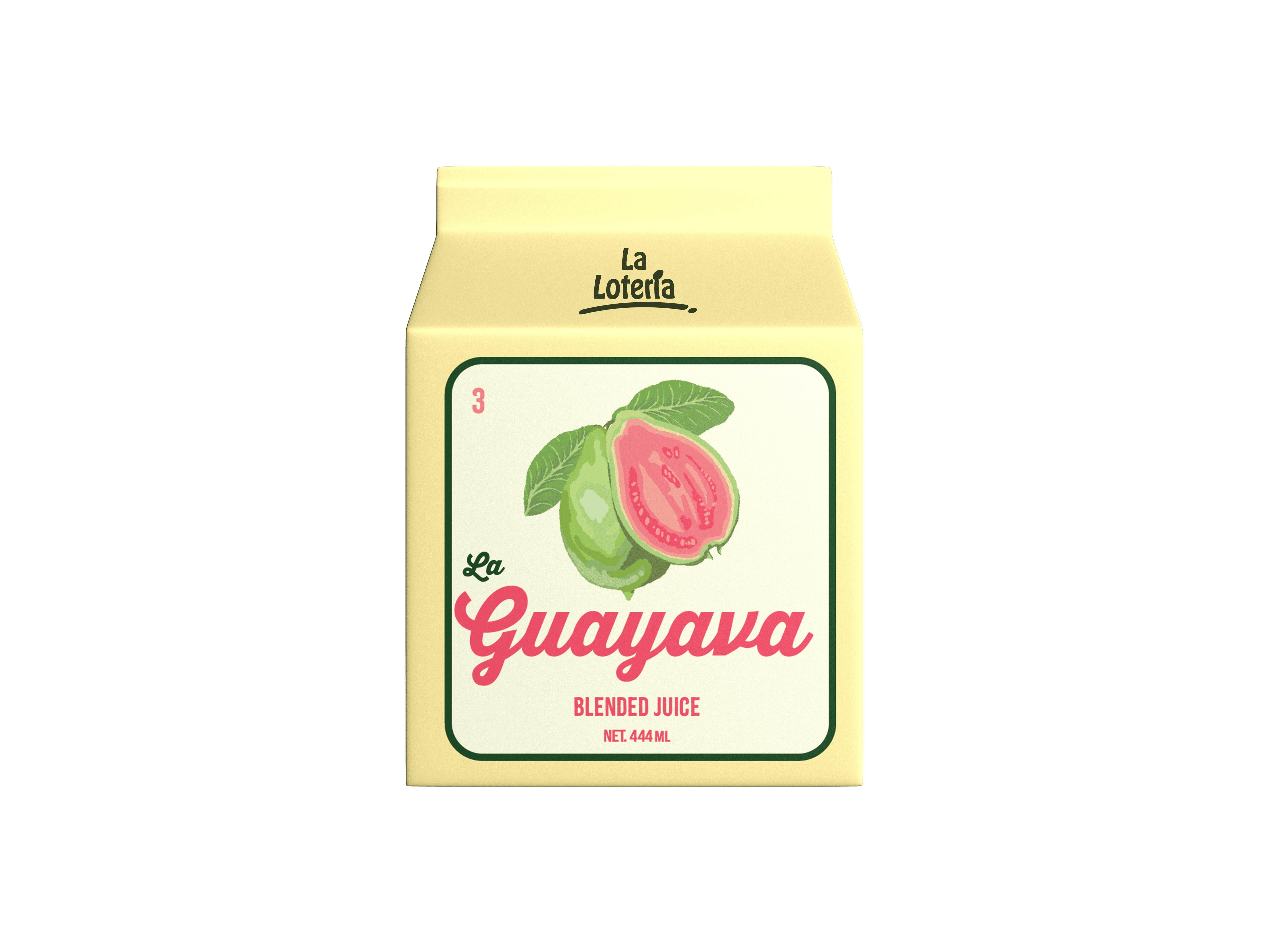
La Loteria was a way to connect my roots with graphic design. La Loteria represents nostalgia and the experience of being a child. I used various elements of the loteria card such as the number or the iconic naming but still having a bit of a modern look to appease my audience, immigrant young adults to adults.





Transportation Design
This package brings everything together and makes it feel like home. I used a blue to stand out from the other competition and because I thought the color fits nicely with the packaging.
It is a very common package container but I think the commonality of the package is what enhances the nostalgia of the brand.
Typography in Package
What is Loteria?
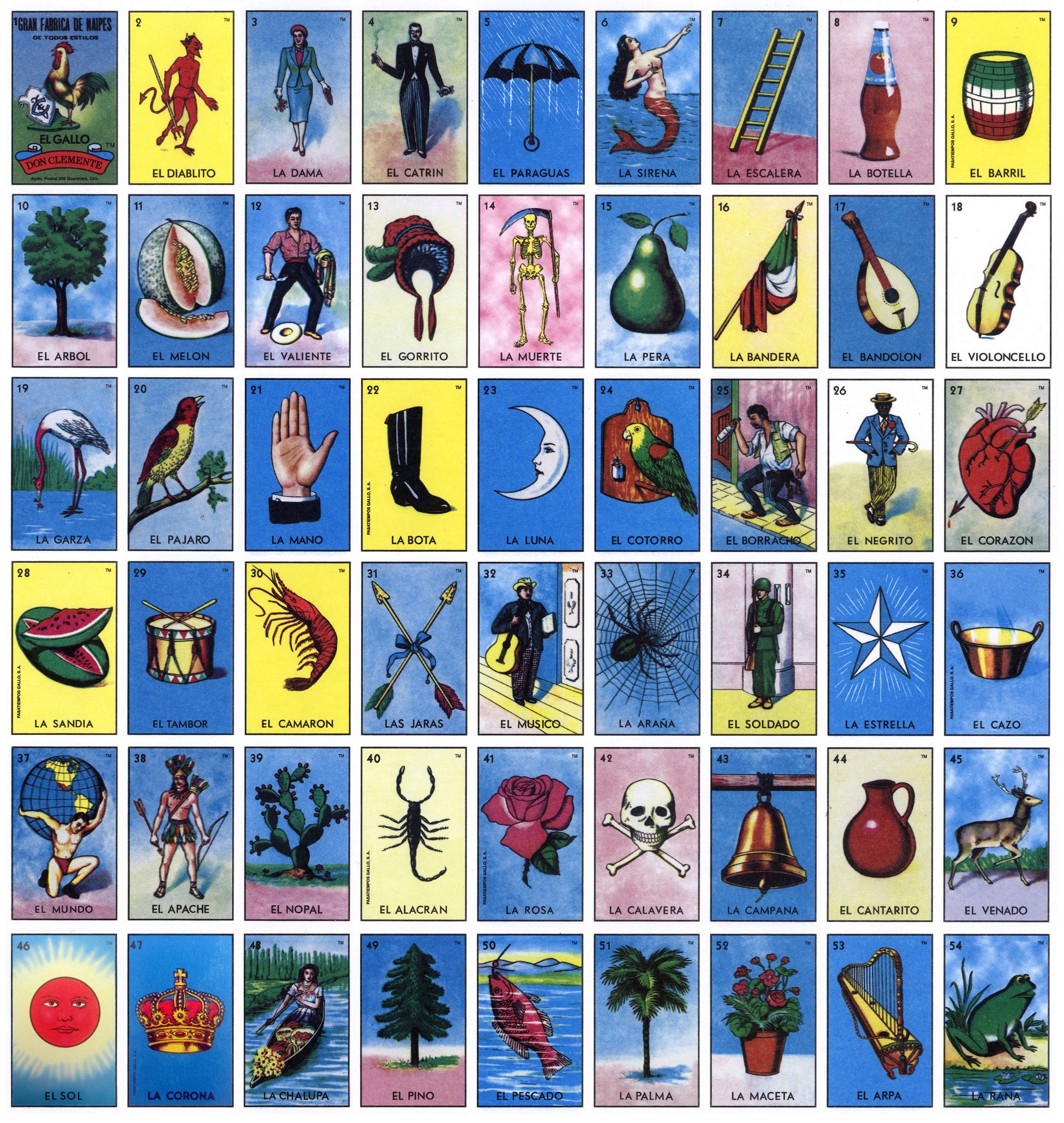
Lotería is a traditional Mexican board game of chance, similar to bingo, and is played on a deck of cards instead of numbered ping pong balls. Every image has a name and an assigned number.
It was one of my favorite games growing up and it often makes me feel nostalgic which is why this project is close to my heart.
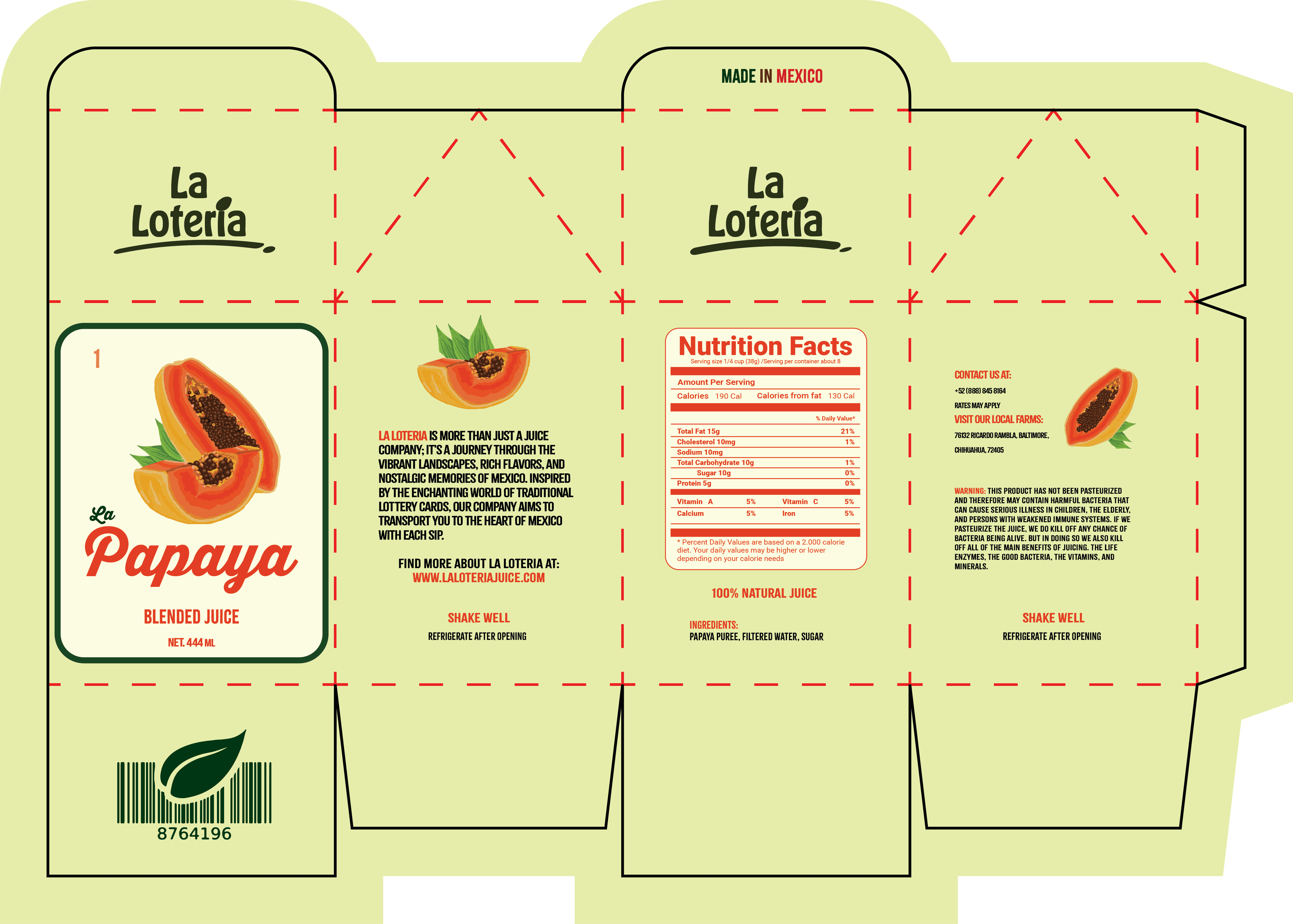
Flats & Mock Up
This image was used as inspiration and meany features from the game have been applied to the brand.
