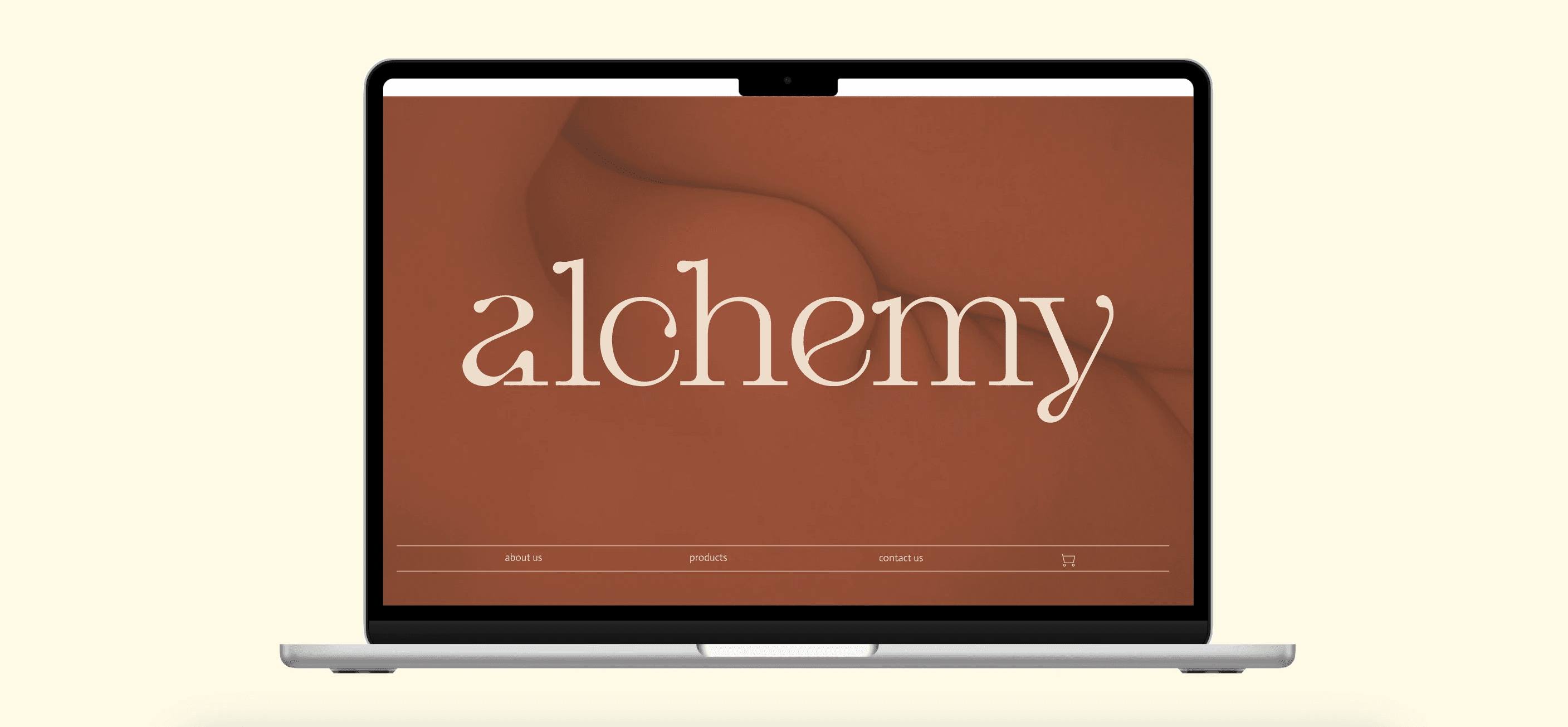
With the logo I attempted to make it very swirly and give it a very round shape to emphasize the brands main goal while still giving it a modern design.
The colors are very earthy which glued along what alchemy is, an all natural based skincare.
Alchemy is a brand that wants to stand out with its inclusivity and make the brand about the organic form of the body as a skin care brand. Our biggest problem is how to make everything perfectly imperfect.
Branding
Problem Statement
Alchemy
Web Design & Advertorial

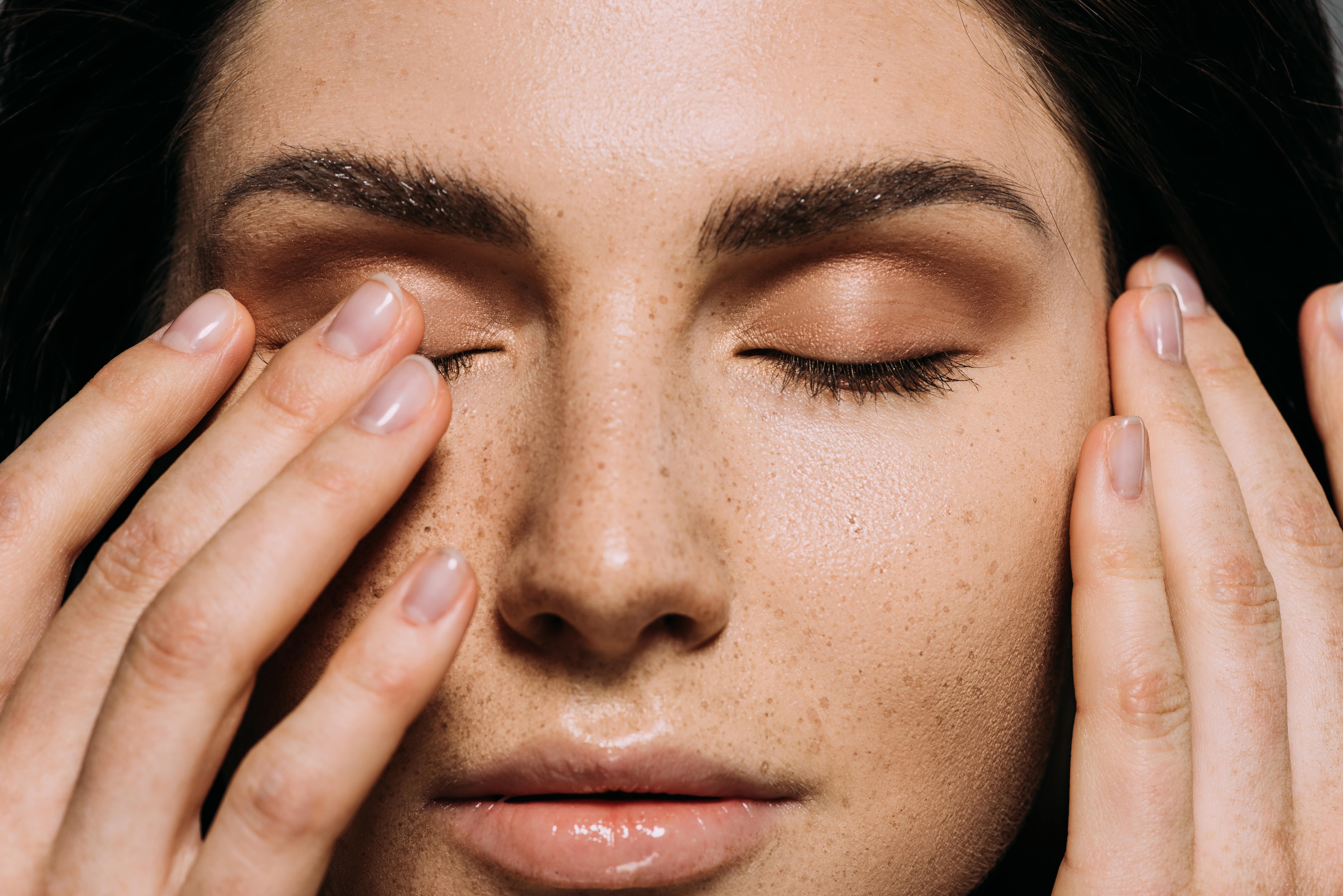
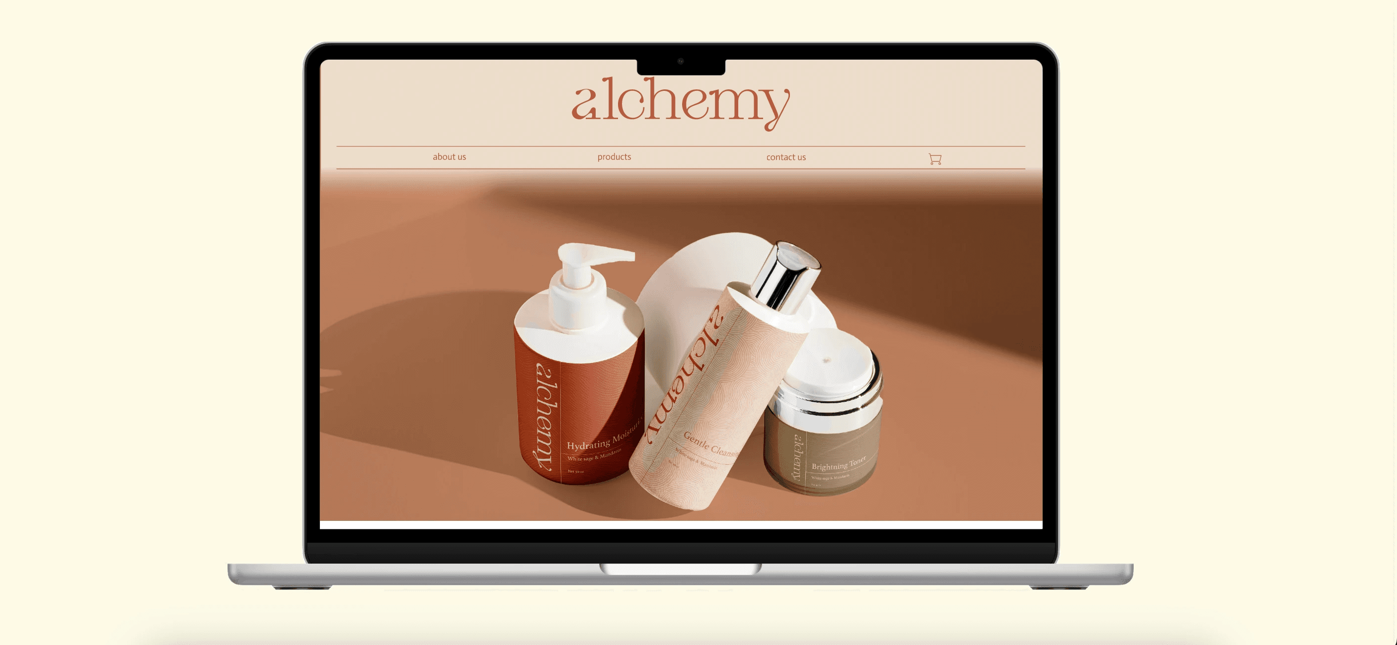
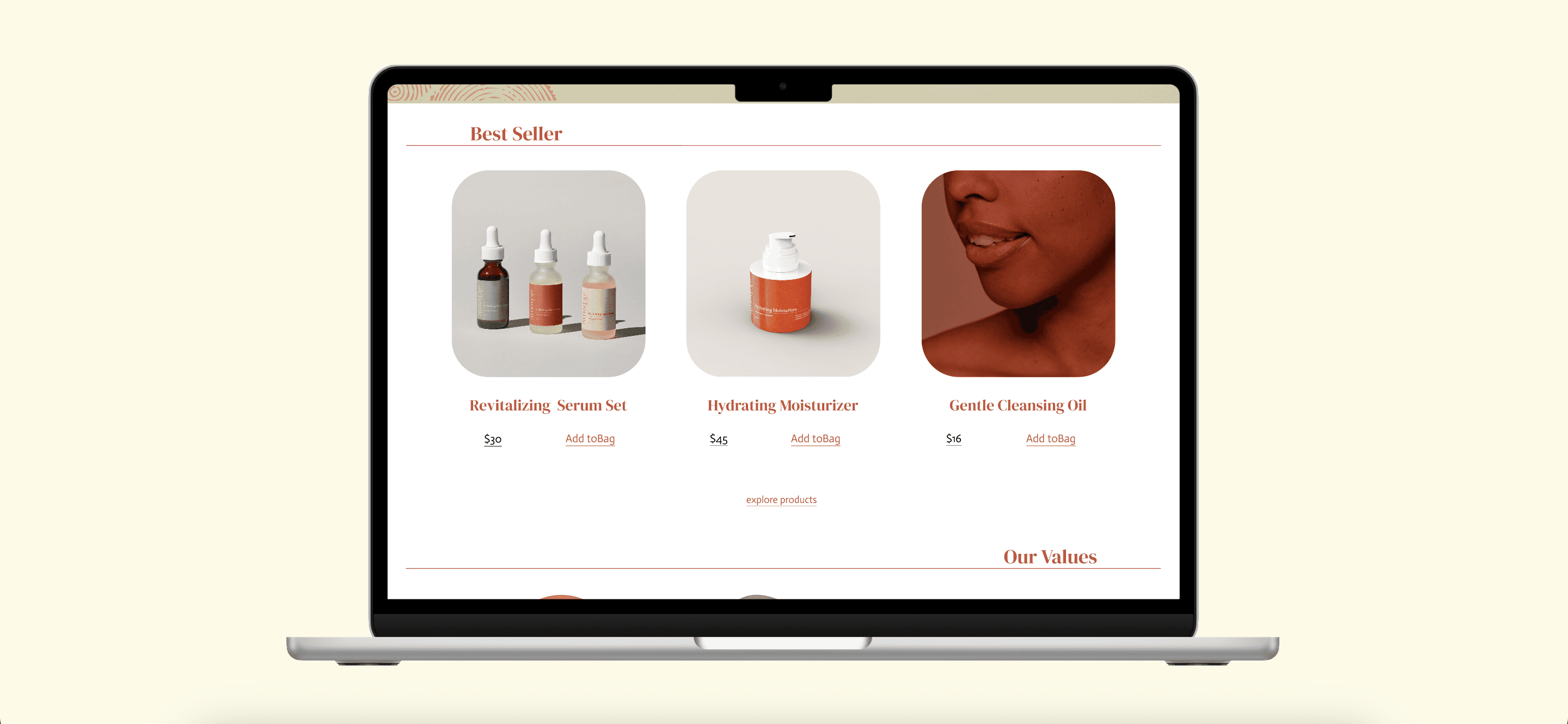
The home page is one of the most important features of a brand as it gives you a first impression and the incentive to proceed and buy products that which is why I tried to continue this imperfect brand with some texture and the imagery used to compliment the products.
Landing Page
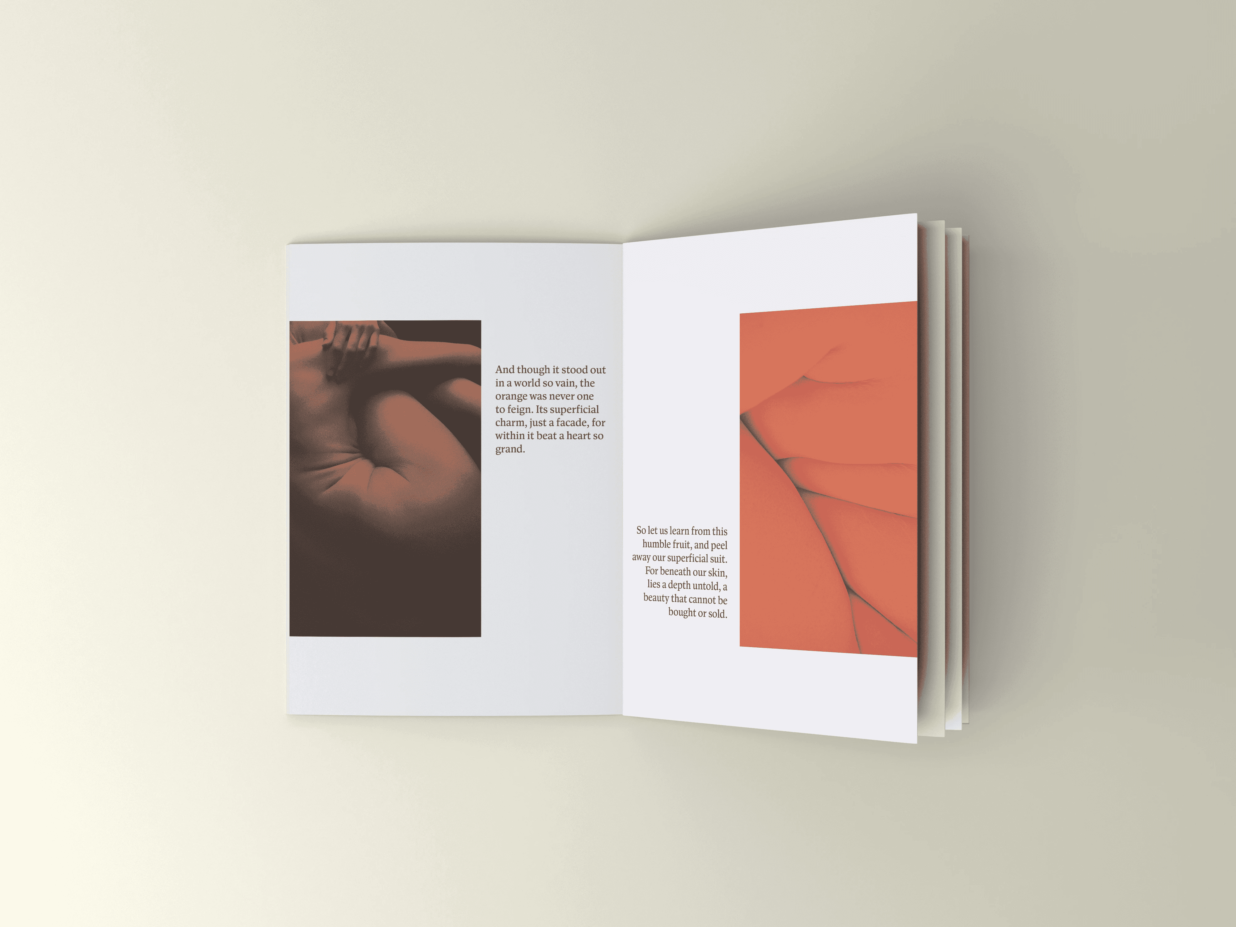
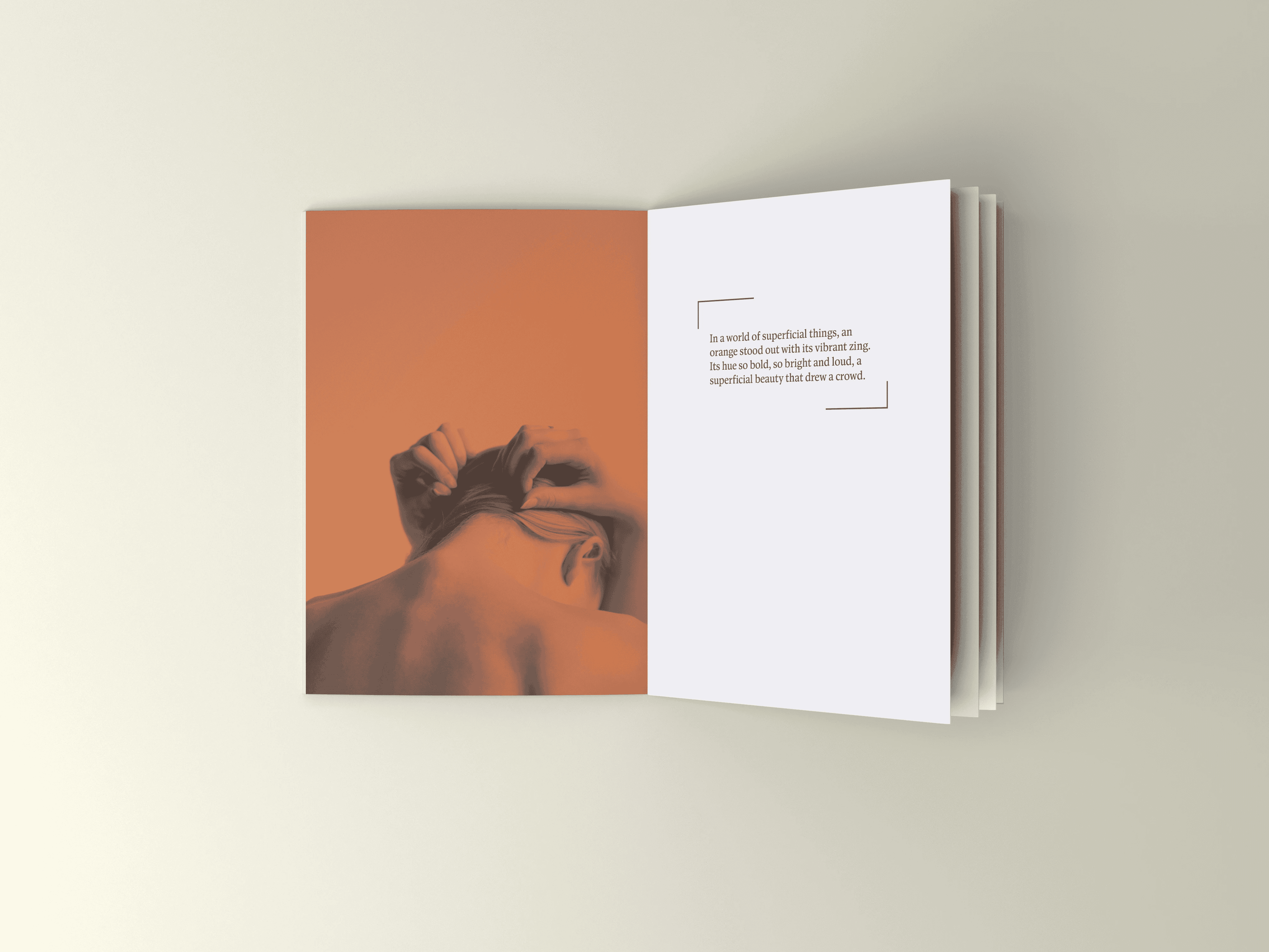
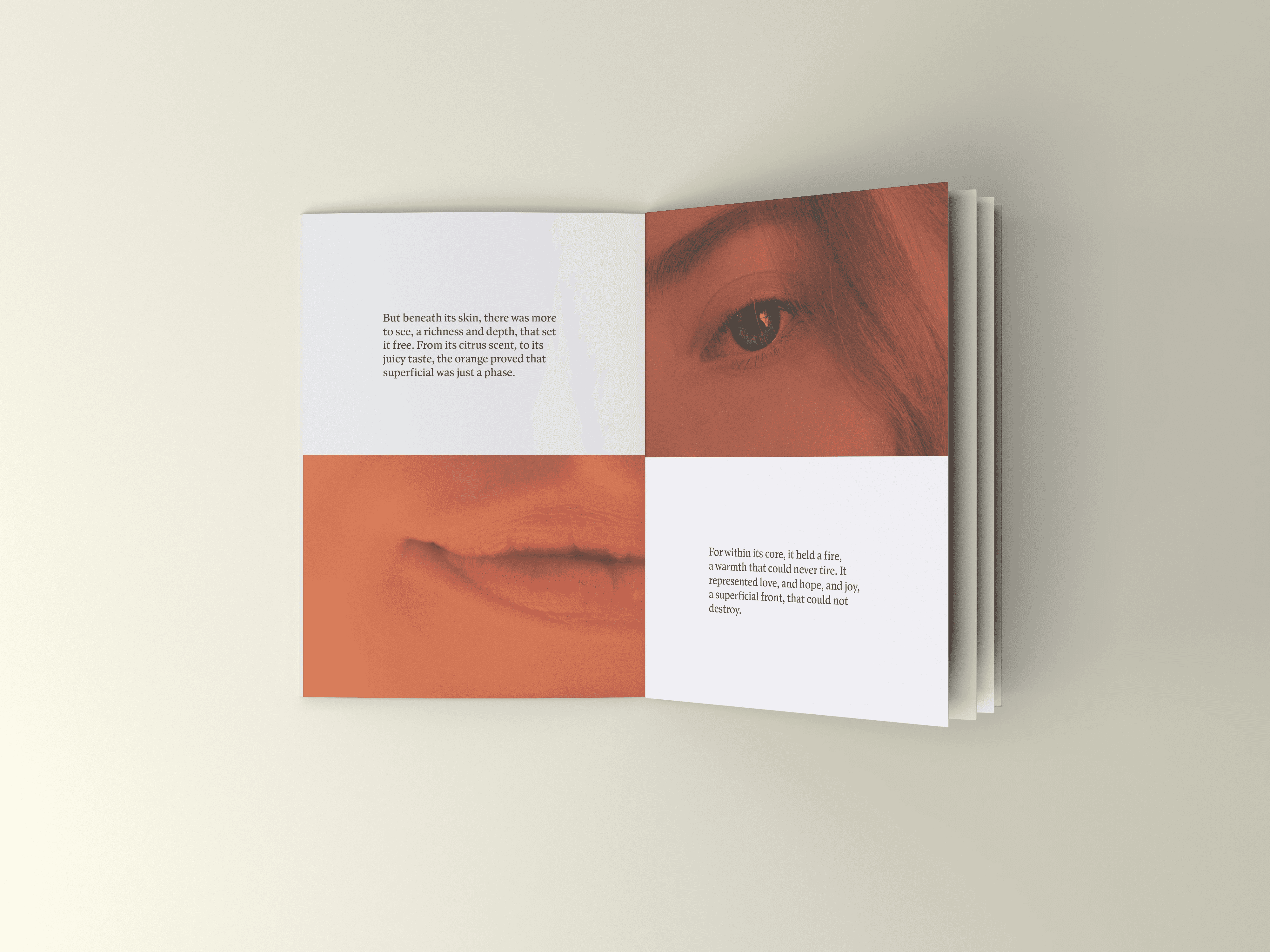
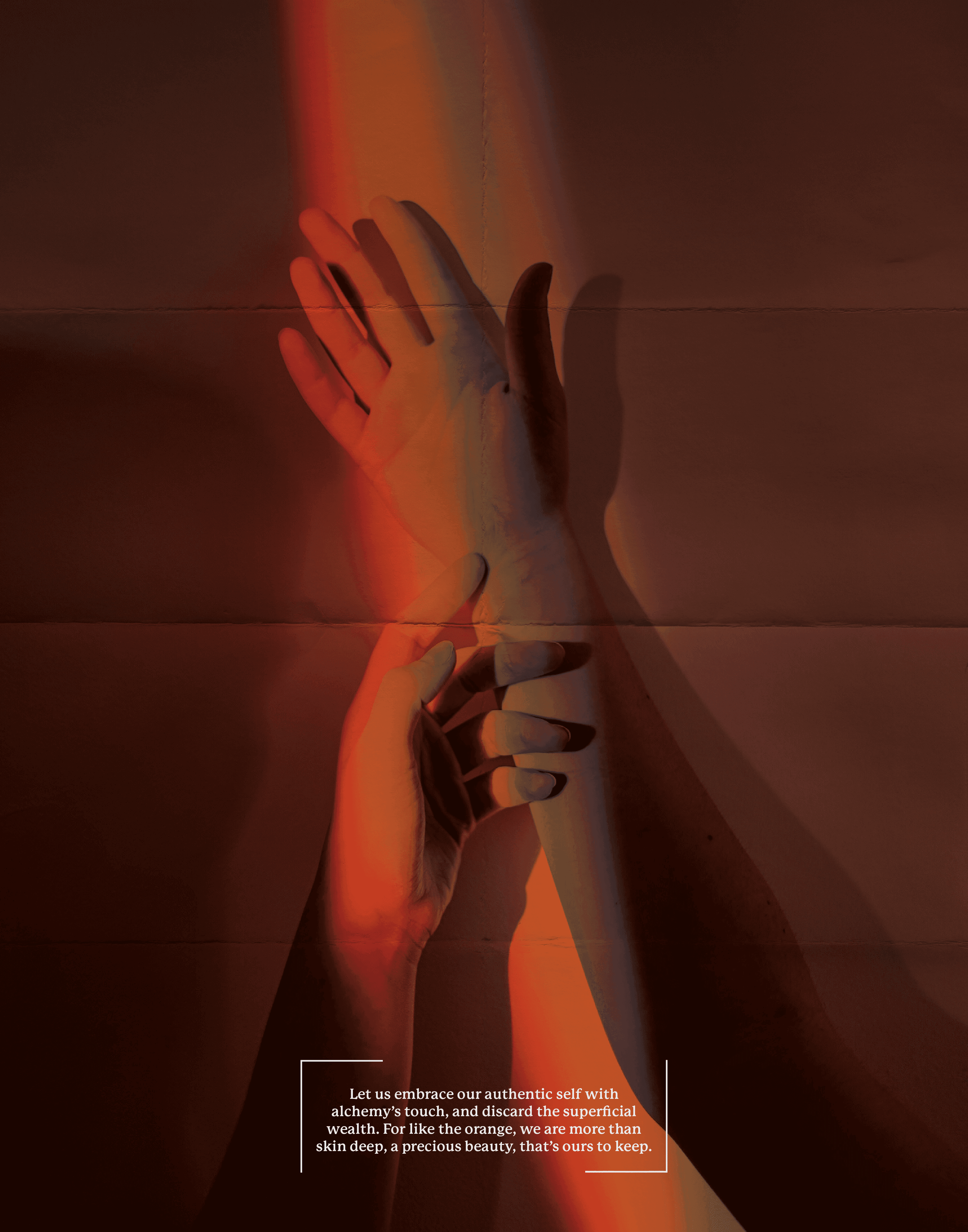
I maintained the consistent pattern of past albums, each comprising four with cohesive imagery. While adhering to the established branding, I added my own style into the mix for a fresh twist.
Advertorial
Rustic Redwood
HEX: #BA5740
RGB: 186, 87, 64
CMYK: 0%, 53%, 66%, 27%
Pantone: 7607 C
Smoked Olive
HEX: #99957A
RGB: 153, 149, 122
CMYK: 0%, 3%, 20%, 40%
Pantone: 7536 C
Serene Sand
HEX: #EBDDCC
RGB: 235, 221, 204
CMYK: 0%, 6%, 13%, 8%
Pantone: 475 CC

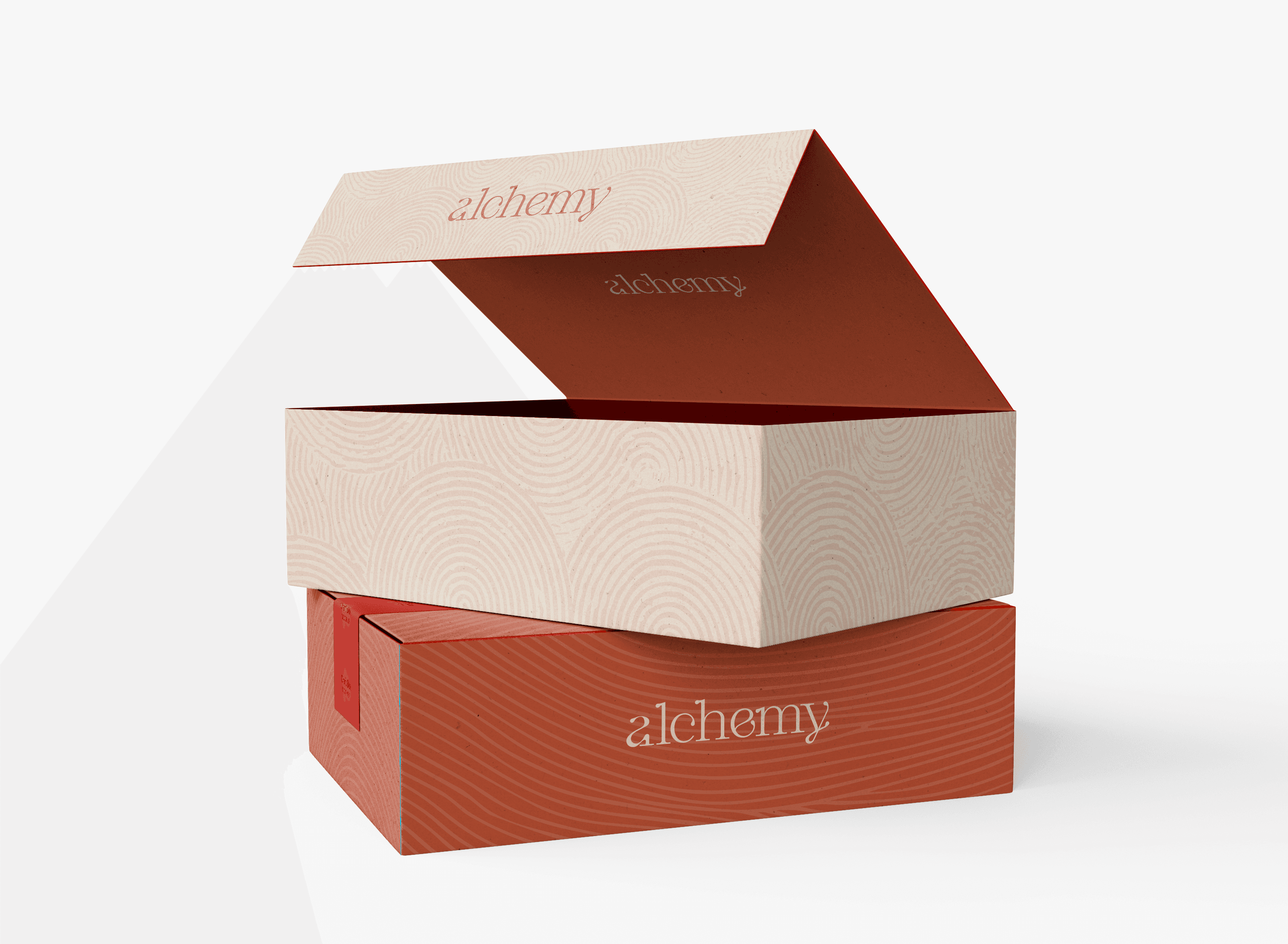
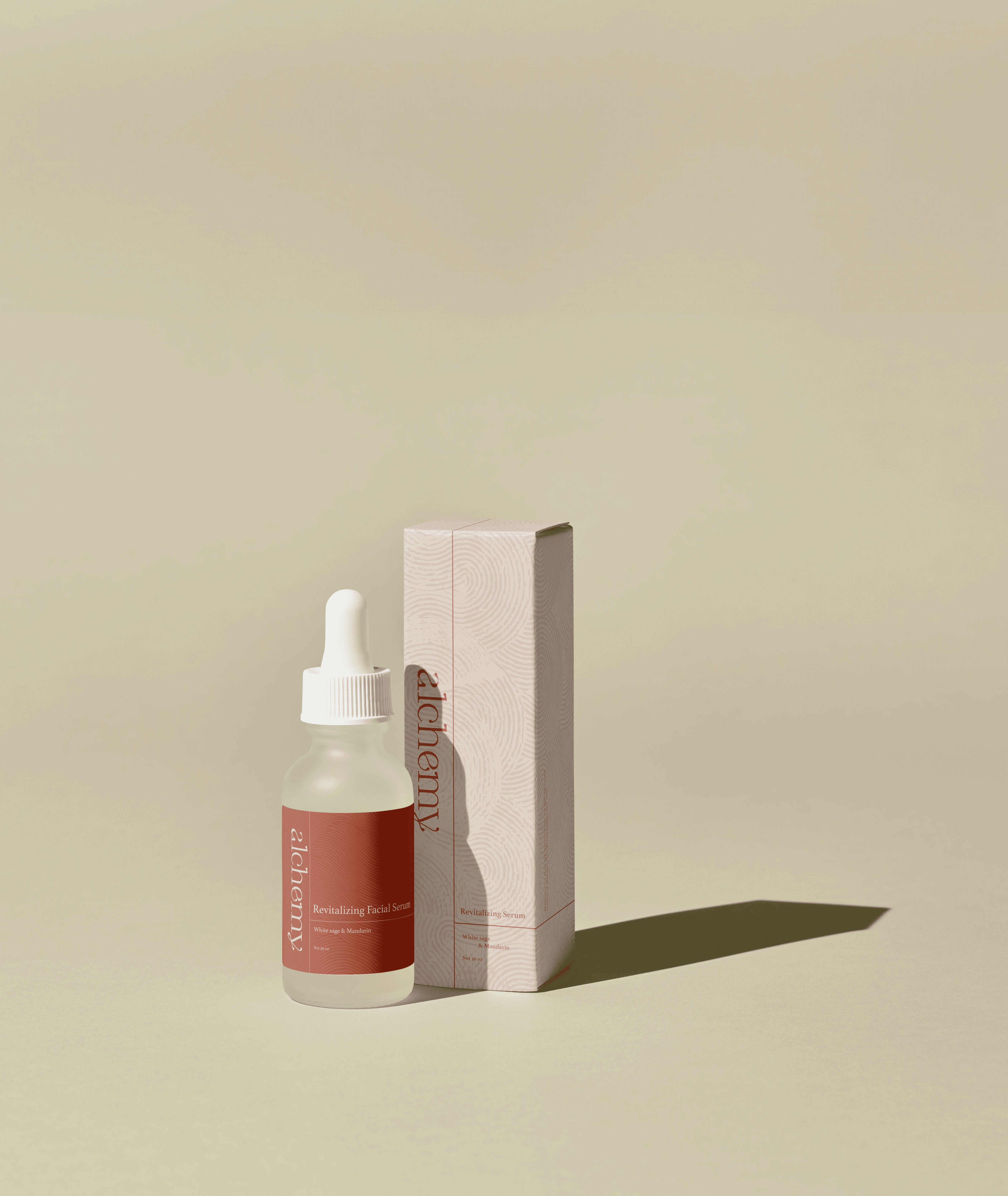
The packaging has a simplistic yet elegant pattern on the label that accurately represent the diverse textures of the skin. While I did many different labels they have a pretty similar layout with the three different patterns shown in branding.
Package Design
Patterns


