Pattern
Peach Whip
HEX:#FBD0C9
RGB: 251, 208, 201
CMYK: 0%, 17%, 20%, 2%
Pantone 169 C
Cotton Candy Pink
HEX: #F297A2
RGB: 242, 151, 162
CMYK: 0%, 38%, 33%, 5%
Pantone 177 C
Strawberry Red
HEX: #EE3256
RGB: 238, 50, 86
CMYK: 0%, 79%, 64%, 7%
Pantone 192 C
Spring Green
HEX: #71BF4D
RGB: 113, 191, 77
CMYK: 41%, 0%, 60%, 25% Pantone 368 C
Typography


Package Design
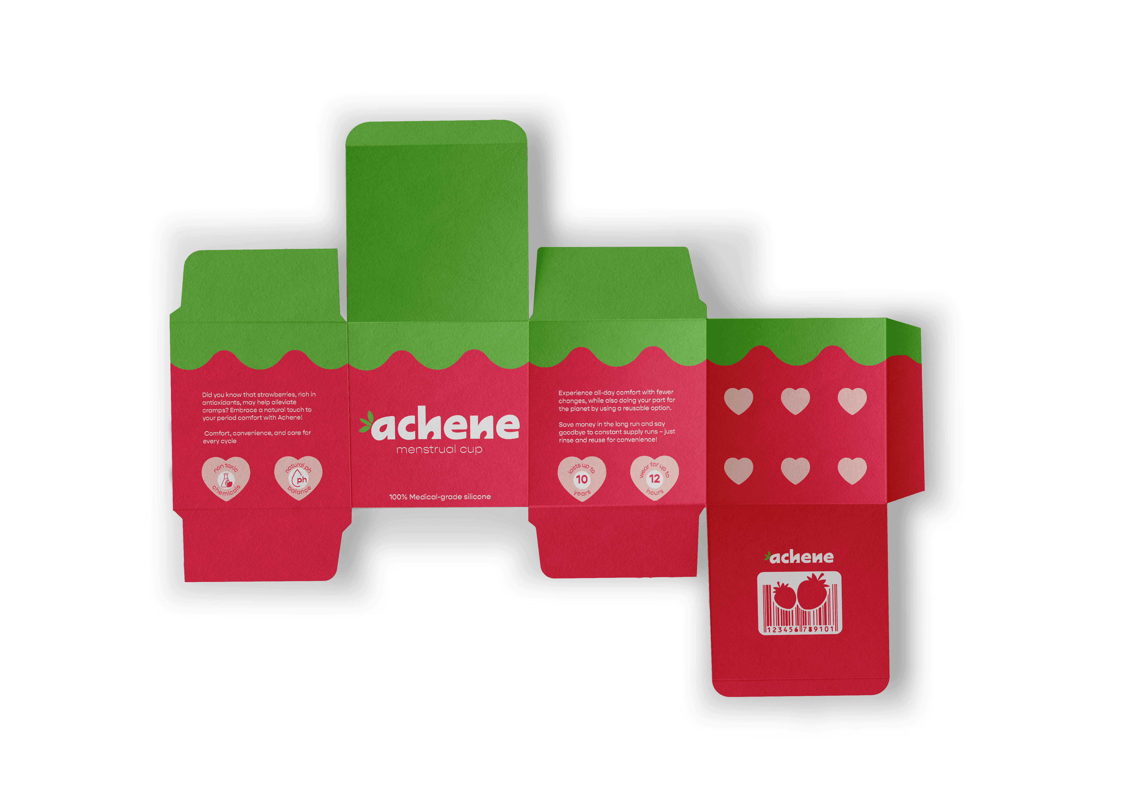
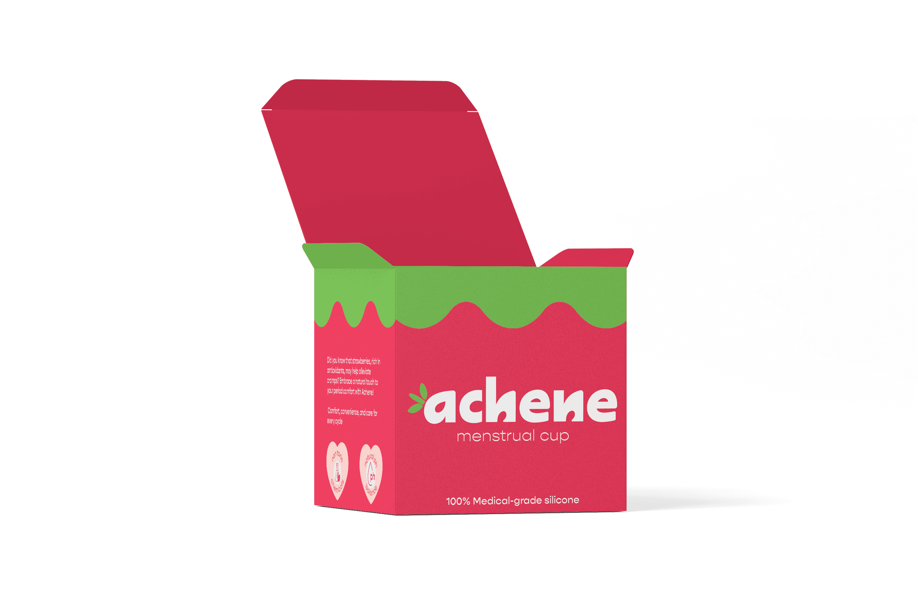
I used round shapes and a font reminiscent of strawberry seeds to keep the brand's friendliness and warmth. Vibrant colors were used, balanced with discrete packaging to ensure privacy. To distinguish the brand and develop confidence with beginners, I placed detailed information on the box.
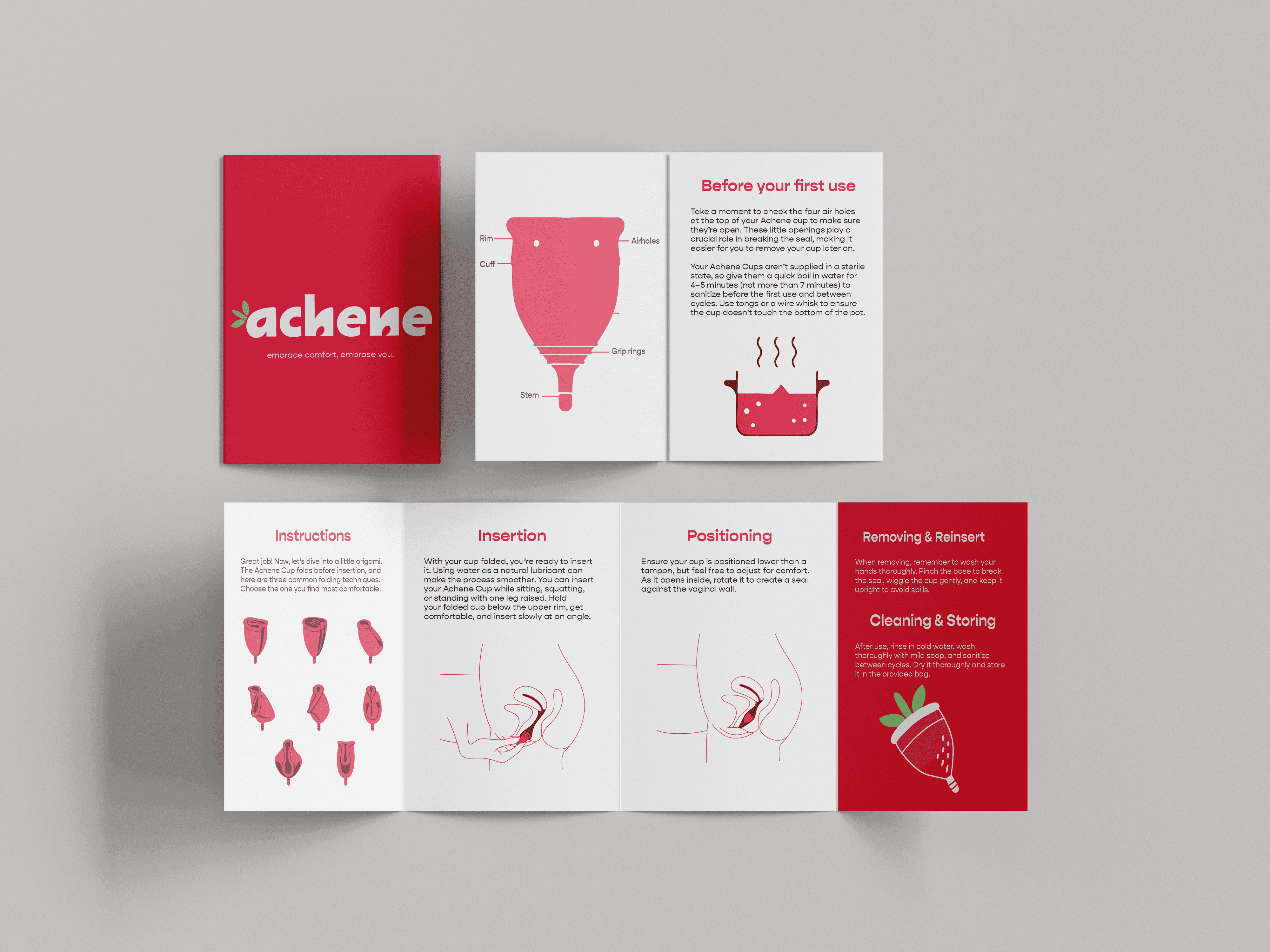
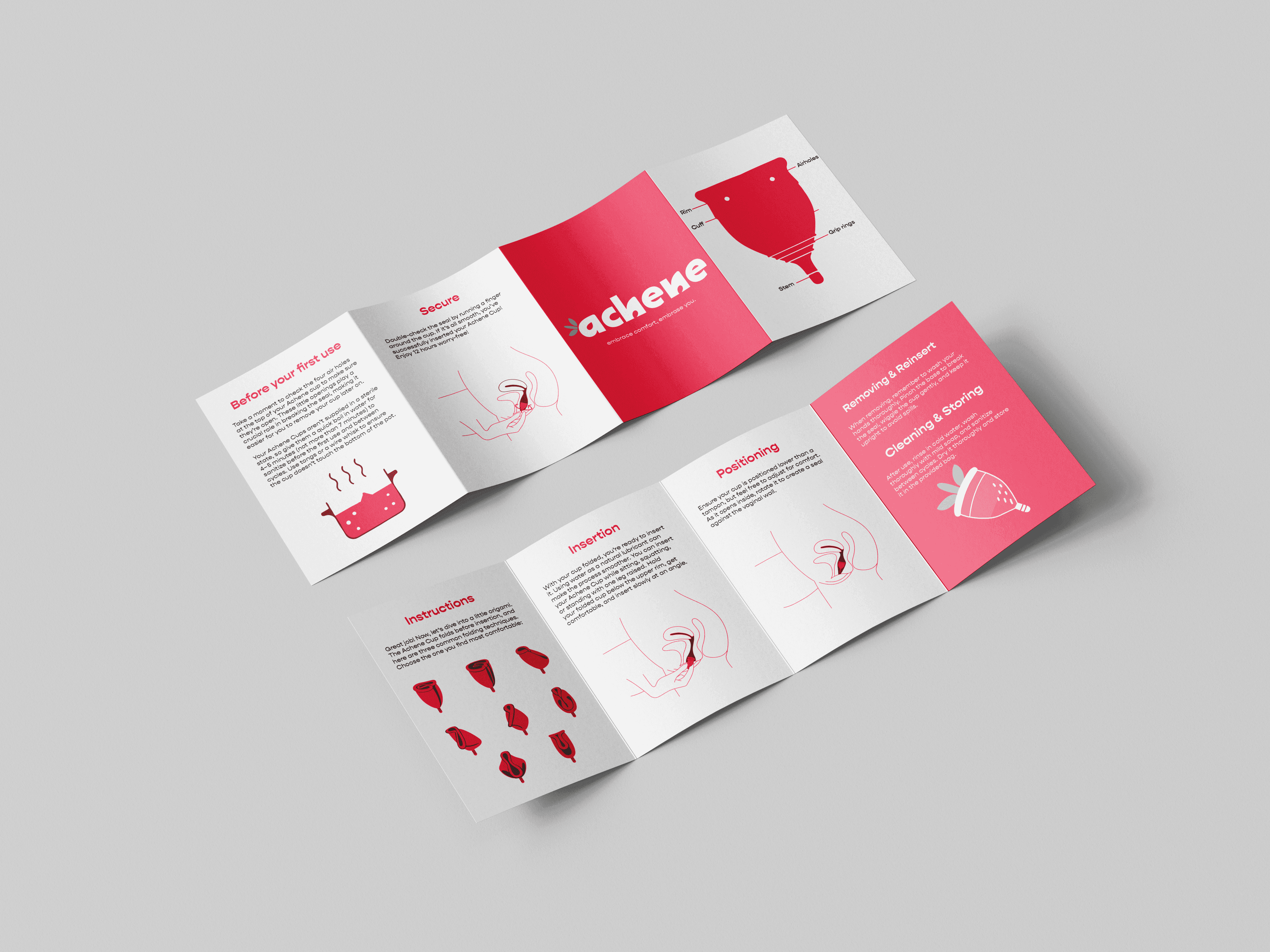
User Manual Design
Achene’s brand is all about being clear and giving all the information to create an intimate connection between Achene and the consumer. For an even clearer guide custom illustrations were made to guide beginners for a safer use.
Logos
The logo's counter mimics the arrangement of strawberry seeds, known as achenes, adding a humorous and appealing touch without relying on obvious iconography. To increase its appeal and emphasize the brand's environmental commitment, I added a leaf and stem, finding a balance between subtlety and friendliness.


